I co-founded Mom’s Bento, a startup offering authentic Malaysian food through vending machines installed on university campuses. I prototyped and designed the user interface for our vending machines to provide a seamless and intuitive ordering experience.
Design brief
My goal was to design a simple, yet effective, way for users to interact with the vending machine and order their food. Since most current vending machines at the time were using pin pad style systems of entering a code (e.g. E9) to order their items, I had to tackle the problem that our machine may feel foreign and thus, harder to interact with.
Discover
Field study
To understand user pain points, I conducted ethnographic field research observing interactions with traditional pin-pad vending machines and modern touchscreen kiosks.
Observations
After observing users interact with the pin pad style vending machines, I identified some key pain points:
Limited feedback Basic displays provide minimal visual feedback - often just numbers or short codes - making error handling unclear. Additionally, the lack of confirmation dialogs can cause user errors by not giving users the chance to change their selection if they've inputted the wrong code.
Confusing interface Users must enter alphanumeric codes (e.g., A4, B6) instead of tapping a simple product image.
Non-intuitive navigation Button-based input often lacks clear instructions or guidance.
Poor Visibility Small, dim LED screens and labels can be hard to read for users.
Comparative analysis
I benchmarked successful interfaces like McDonald’s touchscreen kiosks, noting their easy product scanning, clear order summaries, and simple navigation.
The McDonald's ordering kiosk had some key features we wanted to implement:
Touchscreen interface Designed for quick scanning of products with its intuitive layout, making it easy and simple to choose products by tapping on thumbnail image.
Order summary Easy to confirm product selection before checkout. Gives the customer a chance to correct and choose a different product before paying.
Define
Journey map
Following our user research, I also created a journey map to gain a deeper understanding of our user's needs, motivations, and pain points.
By analyzing this journey map, I can identify the pain points during the decision-making and ordering experience. This helped me focus my design efforts on solutions that tackle the frustrating areas during the overall dining experience.
Defining the goals
After gaining more insight on the problem and pain points, I identified the design objectives:
Enable users to easily scan food choices. Design a simple and straightforward way to decide and confirm food option. Design an attractive and aesthetic display to bring attention to our vending machine.
Ideation
Low-fidelity prototyping
With our objectives in place, it was time to start sketching and brainstorming low-fidelity prototypes for the food ordering task flow.
We explored multiple directions for our overlay menu and settled on a couple options before moving forward to mid-fidelity prototypes on Figma.
Mid-fidelity prototyping
After going through the brainstormed sketches, I moved forward with creating mid-fidelity prototypes to present to the other founders.
Once we had a prototype that we were happy with, we moved forward onto high-fidelity prototyping.
High-fidelity prototyping
After going through the brainstormed sketches, I moved forward with creating mid-fidelity prototypes to present to the other founders.
Development
Prototype design
Once we had a high-fidelity layout and visual design we were happy with, I designed a working prototype with Figma to forward to the vending machine's manufacturing and development team in China.
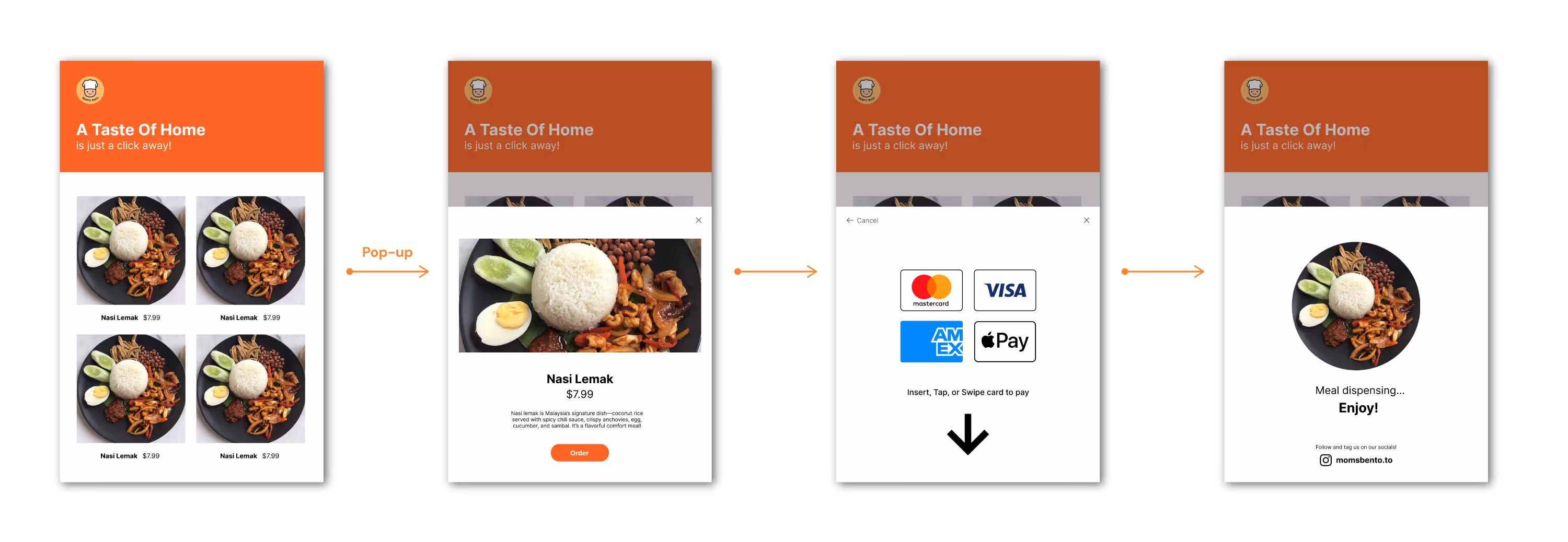
Product selection
Customers can select their food item by tapping on their choice on the home menu.
Order confirmation
After selecting their item, customers get a brief description of the item and have a chance of cancelling their choice, or move forward to payment by tapping the "Order" button.
Payment screen
After confirming their order, customers can use the integrated payment terminal to pay with card.
Meal dispensing
Once the payment is confirmed, the machine will dispense their food, paired with a "Meal dispensing" screen, giving customers visual feedback as well as a call to action to follow us on our socials, as well as posting and tagging our account.
Iteration
Post-launch observations
A few weeks after launching our vending machine on campus, we noticed that there were some indecision when customers were making a purchase. Our vending machine's data suggested that customers were spending a lot of time clicking into the food items before ultimately making their purchase, or not making a choice entirely.
I went to observe this behavior in person and had impromptu interviews with the indecisive customers—which revealed that these customers were hesitant about their decisions because there was no nutritional information about the food packs before placing their orders.
After listening to the customer's feedback, I redesigned the product page overlay to include nutritional facts to aid with the customer's decision making when choosing between products. This design iteration led to a decrease in decision paralysis in our customers.
Reflection
Looking back on the design, we were happy with the final product and the results in a modern and simple interface for our customers to interact with the vending machine and order their food. This design resulted in a smooth launch of our vending machine. With its simple interface, even with a crowded lineup during our launch, the design aided in a smooth experience for our customers, which moved the line efficiently.